June 29, 2026 · 8:21 AM
Fitts's Law: why button size and distance matter
A practical guide to using Fitts's Law in interface design: make important actions easier to reach, size touch targets responsibly, and separate controls to reduce errors.
The short version
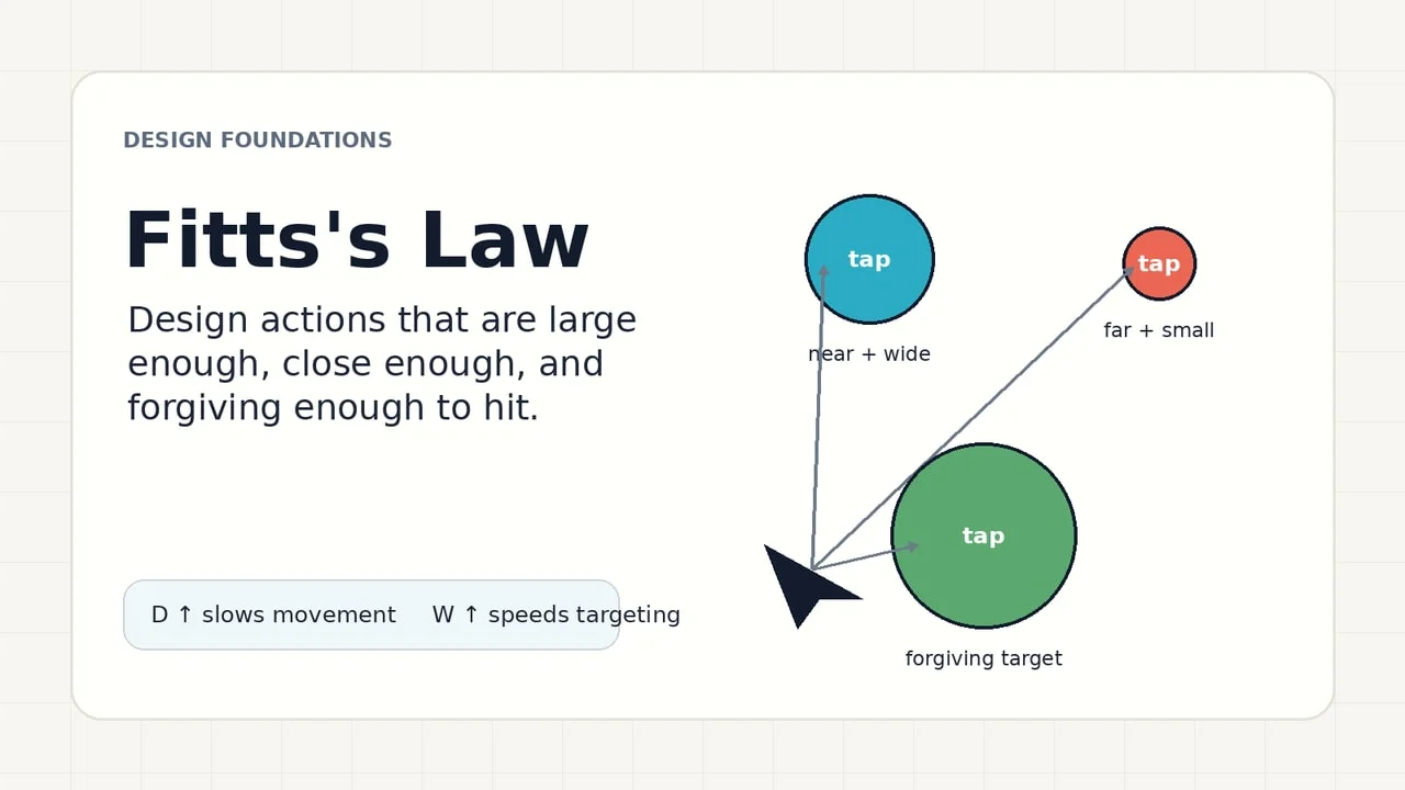
Fitts's Law explains why some interfaces feel easy to use before a user can name why: the time it takes to hit a target depends on how far away the target is and how large it is along the movement path. In interface design, that turns into a practical rule: make important actions large enough, place them close to where attention and hands already are, and do not crowd them with competing targets. Nielsen Norman Group summarizes the law in the same terms: movement time depends on target distance and target size. 1
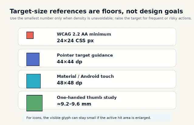
This is not just a speed trick. Target size and spacing are accessibility issues: WCAG 2.2 says pointer targets should be at least 24 by 24 CSS pixels unless a listed exception applies, and the criterion is intended to reduce accidental activation for people with dexterity limitations, tremors, spasticity, quadriplegia, or less precise input devices. 2
What Fitts's Law says
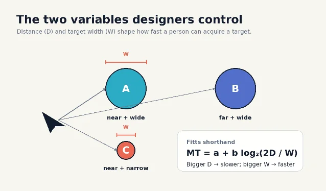
Paul Fitts's original 1954 paper studied the information capacity of the human motor system in controlling movement; it became one of the foundations of human-computer interaction because pointing, tapping, dragging, and selecting are all motor tasks. 3 In UI terms, the law focuses on two variables:
- D, distance: how far the pointer, finger, stylus, or hand has to travel.
- W, target width: how much usable target area exists in the direction of movement.
You do not need the formula to use the idea. A closer target is faster to acquire. A larger target is more forgiving. A small, far-away target costs more time and accuracy than a large target near the user's current focus. NN/g also notes that, for common rectangular UI targets, designers can often think in terms of the smaller target dimension because that is the limiting side for acquisition. 1
What it means in interface design
Treat target size as a form of interface priority. The actions people use most, the actions that move a task forward, and the actions that are hard to recover from deserve more physical forgiveness than secondary controls.
A useful pattern is to sort controls into three groups:
| Control type | Design implication |
|---|---|
| Primary and frequent actions | Make the hit area generous and place it near the user's task flow. |
| Secondary actions | Keep them reachable, but do not let them compete visually or spatially with the primary action. |
| Destructive or high-cost actions | Avoid tiny targets, add spacing, and separate them from safe neighboring actions. |
The law also explains why icon-only controls often feel fragile. NN/g points out that an icon plus a text label can create a larger clickable target than an icon alone, assuming the whole combined area is actually active. 1 If the label looks clickable but only the 16 px icon responds, the interface is visually promising more target area than it provides.
Target size is an accessibility issue
WCAG 2.2's Target Size (Minimum) criterion sets a floor, not an ideal: pointer targets should be at least 24 by 24 CSS pixels unless they qualify for exceptions such as sufficient spacing, an equivalent larger control, inline text links, unmodified browser controls, or essential presentation constraints. 2 The same W3C guidance says larger sizes remain a best practice, especially for important links and controls. 2
Android's accessibility guidance recommends interactive elements of at least 48 by 48 dp, and explains that a 24 by 24 dp icon can still sit inside a 48 by 48 dp touch target through padding. 4 The same page recommends 8 dp or more between touch targets, describes 48 by 48 dp as about 9 mm, and gives 7 to 10 mm as a recommended physical range for touchscreen objects. 4
A mobile thumb study in the ACM Digital Library found that, for one-handed handheld use, error rates stopped showing significant differences above roughly 9.6 mm in discrete tasks and above roughly 7.7 mm in serial tasks; the authors concluded that about 9.2 mm for discrete tasks and 9.6 mm for serial tasks should be sufficiently large for one-handed thumb use without degrading performance or preference. 5
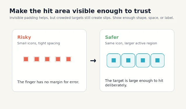
Hit area is not the same as visual size
A button's visible shape and its active hit area can be different. This is especially important for dense mobile interfaces, icon buttons, checkboxes, switches, and rows in a list.
Android's guidance states this directly: touch targets extend beyond the visual bounds of an element, so a 24 by 24 dp icon may still use surrounding padding to form a 48 by 48 dp touch target. It also names implementation approaches such as
android:minWidth, android:minHeight, TouchDelegate, and Compose's Modifier.sizeIn. 4The design mistake to avoid is an invisible mismatch:
- A small icon has a large, padded hit area: good.
- A row label and icon look like one control, but only the icon is tappable: bad.
- Several tiny icons each have expanded hit areas, but the active regions overlap: risky.
- A destructive icon sits directly beside a common safe action: slow down, separate, or add confirmation.
Where to apply it
Use Fitts's Law whenever a user must point, tap, drag, select, or grab something.
Primary calls to action
Place the main task action where the user's attention naturally arrives after scanning the content. If the action is essential, give it a larger hit area than secondary choices and avoid placing a competing control directly beside it.
Navigation
Top navigation can work well for mouse-driven desktop layouts, especially when screen edges help stop the cursor. NN/g notes that screen edges can behave like large or "infinite" targets for mouse-driven interfaces because the pointer cannot overshoot past the edge. 1 This benefit does not transfer cleanly to touchscreens, where fingers can overshoot the visual edge.
Forms
Labels, checkboxes, radios, toggles, steppers, and date controls should use the whole logical row or label area where appropriate. A checkbox that requires a precise tap on the square wastes the larger target that the label could provide.
Menus and toolbars
Dense controls can be efficient for experts, but they need spacing and predictable grouping. If two adjacent actions have very different consequences, spacing is not visual polish; it is error prevention.
Mobile thumb use
On phones, distance is partly about hand posture. A control may be visually close but physically awkward if it forces a thumb stretch or grip shift. Important mobile actions should be tested in the posture people actually use, not only on a centered desktop preview.
A quick audit checklist
Use this five-minute pass on any screen with interactive controls:
- Mark the top three actions. Are they physically easier to hit than lower-priority controls?
- Measure the active area, not the icon. Does the tappable or clickable region meet your platform target-size rule?
- Check spacing between neighboring targets. Would a slightly inaccurate tap hit something else?
- Test the screen with one hand. On mobile, does the main action sit inside a comfortable thumb path?
- Separate high-cost actions. Delete, cancel, close, and destructive options need space from safe actions.
- Make labels work. If an icon and label visually form one target, make the whole combined area active.
- Do not hide the hit area in implementation. Confirm that the coded component matches the design spec, especially for custom icons and list rows.
The rule to keep
Fitts's Law turns an abstract feeling into a design test: if a control is important, make it easier to reach and harder to miss. The best version is often not a bigger-looking button. It is a larger active area, better spacing, and placement that respects where the user's eyes, cursor, finger, or thumb already are.
Add more perspectives or context around this Post.